Source: Uber
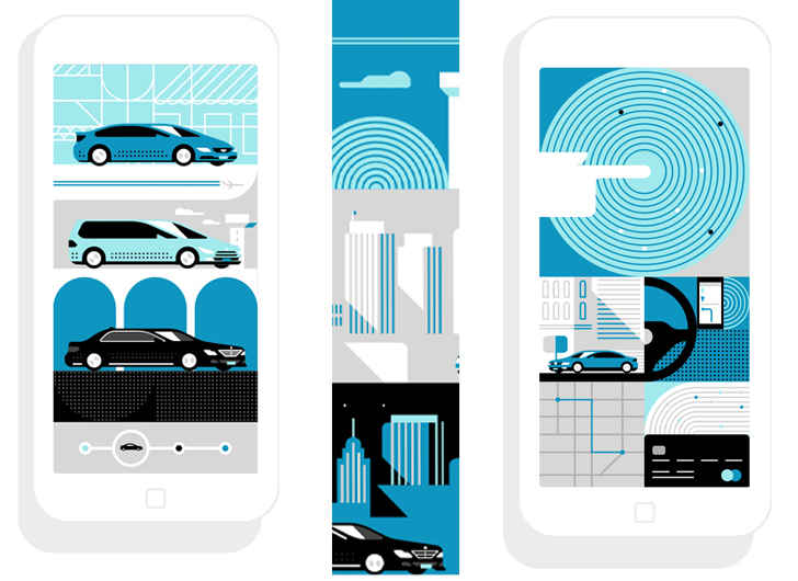
Uber may look a little different these days, but don’t fret, the ride-sharing transportation company hasn’t changed. The company updated its look, opting for a change in color and design, giving the application a bright new modern feel.
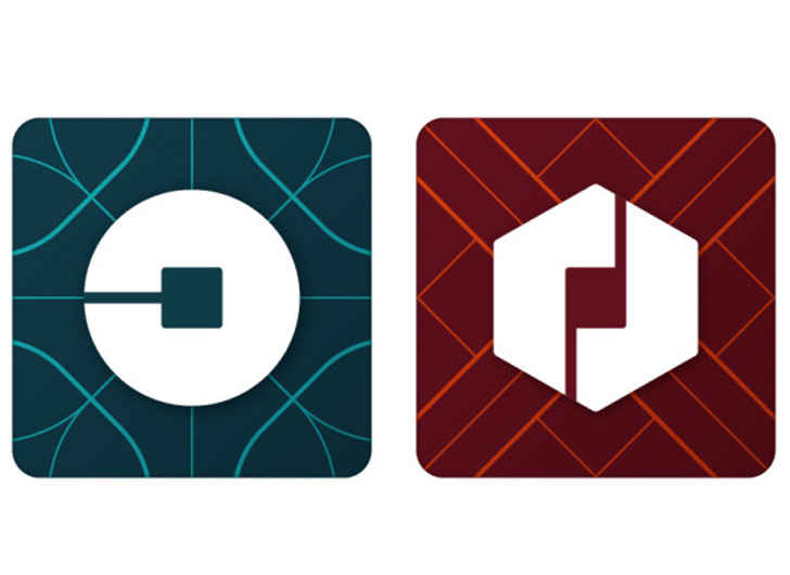
The black and white app icon was replaced with a blue geometrical design, similar to the background of the revamped website.
There will be a difference in the shape of icon depending on if they are a driver versus a rider. Drivers will see a hexagonal shape whereas riders will see a circular shape.

Source: Uber
The color variation will change from country to country. For example, China’s color scheme is red, where the United States is dark blue.

Source: Talia Herman/Wired
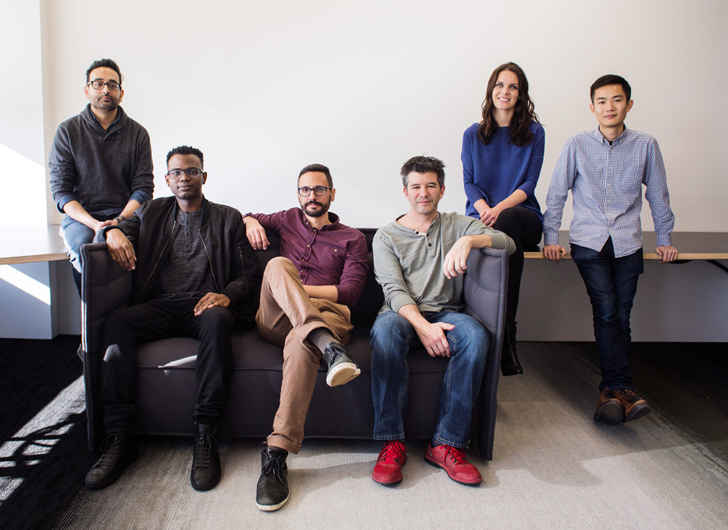
CEO and co-founder, Travis Kalanick, although not a designer, was very involved in the re-branding. The entrepreneur spoke to Wired magazine about launching the new look. Prior to the launch he admitted, “I don’t know what’s going to happen,” explaining people may take time to adjust to the new look, “but I feel that it’s going to be good.”